Unit 1 Describing Data
Review
- Determine whether the data are qualitative or quantitative:
- the colors of automobiles on a used car lot
qualitative - the numbers on the shirts of a soccer team
qualitative - the number of seats in a movie theater
quantitative - a list of house numbers on your street
qualitative - the ages of a sample of 350 employees of a large hospital
quantitative
- the colors of automobiles on a used car lot
-
Identify the population and the sample.
- A survey will be given to 100 students randomly selected from the freshmen class at Lincoln High School.
Sample: 100 freshmen students at Lincoln High School
Polulation: freshman students at Lincoln High School
- Fifty bottles of water were randomly selected from a large collection of bottles in a company's warehouse.
Sample: 50 bottles in the warehouse
Polulation: bottles in the warehouse
- You’re interested in knowing what percent of all households in a large city have a single woman as the head of the household. To estimate this percentage, you conduct a survey with 200 households and determine how many of these 200 are headed by a single woman.
Sample: 200 households surveyed in the city
Polulation: households in the city
- A survey will be given to 100 students randomly selected from the freshmen class at Lincoln High School.
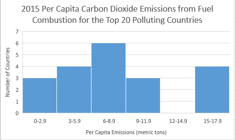
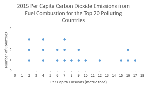
- Here we list the 20 countries that emitted the most carbon dioxide in 2015.
Rank and Country 2015 Per Capita Carbon Dioxide Emissions from Fuel Combustion (metric tons) 1 China 6.6 2 United States 15.5 3 India 1.6 4 Russia 10.2 5 Japan 9.0 6 Germany 8.9 7 South Korea 11.6 8 Iran 7.0 9 Canada 15.3 10 Saudia Arabia 16.9 11 Brazil 2.2 12 Mexico 3.7 13 Indonesia 1.7 14 south Africa 7.8 15 United Kingdom 6.0 16 Australia 15.8 17 Italy 5.5 18 Turkey 4.1 19 France 4.4 20 Poland 7.3
Construct the following using the data: Frequency Distribution, Relative Frequency Distribution, Cumulative Frequency Distribution, Histogram, Dot Plot, Stem and Leaf. For the frequency distribution use 6 classes and start the first class at 0.
Frequency EMISSIONS FREQUENCY 0 – 2.9
3
3 - 5.9
4
6 - 8.9
6
9 - 11.9
3
12 - 14.9
0
15 - 17.9
4
Relative Frequency EMISSIONS RELATIVE
FREQUENCY0 - 2.9
15%
3 – 5.9
20%
6 - 8.9
30%
9 - 11.9
15%
12 - 14.9
0%
15 - 17.9
20%
Cumulative Frequency EMISSIONS CUMULATIVE
FREQUENCY0 - 2.9
3
3 - 5.9
7
6 - 8.9
13
9 - 11.9
16
12 - 14.9
16
15 - 17.9
20
Stem Leaves 1
6 7
2
2
3
7
4
1 4
5
6
0 6
7
0 3 8
8
9
9
0
10
2
11
6
12
13
14
15
3 5 8
16
9
Legend 16
9 = 16.9
-
Below is a random sample of life expectancies from 20 countries:
70.5 65 70 51.5 57.5 61 78.5 61 72 64.5 56.5 73 69 52.5 78.5 54 74.5 76 70 68.5 - Make a frequency table of the life expectancies.
Use 6 classes and start the first class at 50.
Class Frequency 50.0 – 54.9
3
55.0 – 59.9
2
60.0 – 64.9
3
65.0 – 69.9
3
70.0 – 74.9
6
75.0 – 79.9
3
- Answer the following questions based on your histogram:
- What are the class midpoints?
52.45, 57.45, 62.45, 67.45, 72.45, 77.45
- What are your lower class limits?
50.0, 55.0, 60.0, 65.0, 70.0, 75.0
- What are your upper class limits?
54.9, 59.9, 64.9, 69.9, 74.9, 79.9
- Draw a histogram:
- Use the same data to create a relative frequency distribution:
Classes Relative Frequency 50.0 - 54.9
3/20 = 15%
55.0 - 59.9
2/20 = 10%
60.0 - 64.9
3/20 = 15%
65.0 - 69.9
3/20 = 15%
70.0 - 74.9
6/20 = 30%
75.0 - 79.9
3/20 = 15%
- What are the class midpoints?
- Make a frequency table of the life expectancies.
- Use the following data to complete a-e:
AIDS data indicating the number of months a patient with AIDS lives after taking a new antibody drug are as follows (smallest to largest):
3 4 8 8 10 11 12 13 14 15 15 16 16 17 17 18 21 22 22 24 24 25 26 26 27 27 29 29 31 32 33 33 34 34 35 37 40 44 44 47 - Calculate the measures of center from the given list of numbers.
Mean:
23.6 Median:
24 Mode:
multi-modal Midrange:
25 - Create a frequency table using 2 as the lower limit of the first class and a class width of 8.
CLASS FREQUENCY 2 - 9
4
10 - 17
11
18 - 25
7
26 - 33
10
34 - 41
5
42 - 49
3
- ESTIMATE the mean of the data using the frequency table.
Mean = 23.5 - ESTIMATE the median of the data using the frequency table. First, identify the position of the median. Which CLASS in the frequency table contains the median?
The position of the median is 41/2 = 20.5, so the 21st term, which is in the third CLASS 18 - 25.
- Calculate the measures of center from the given list of numbers.
- These are the volumes (in ounces) of randomly selected cans of Coke. Find the Mean, median, mode, and midrange.
12.3 12.0 12.1 12.3 12.2 12.3 12.2 Mean = 12.2 Median = 12.2 Mode = 2.3 Midrange = 2.15 - Find the mean of the following frequency distribution:
GPA FREQUENCY CLASS MIDPOINT
Frequency x Midpoint
0 - 0.9 4 0.45
1.8
1 - 1.9 7 1.45
10.15
2 - 2.9 12 2.45
29.4
3 - 3.9 15 3.45
51.75
4 - 4.9 6 4.45
26.7
SUM = 44
SUM = 119.8
119.8/44 = 2.72
MEAN = 2.72
- What is the shape of the data represented in the frequency distribution?
Skewed to the left
- The ages of the employees at a local newspaper are given. Use the data to complete a-d:
20 26 52 30 21 36 34 60 57 51 56 63 42 - Calculate the measures of variation from the given list of numbers.
Range = 43 Variance = 232.6 Standard Deviation = 15.3 - Create a frequency table using 20 as the lower limit of the first class and a class width of 10.
CLASS FREQUENCY MIDPOINT
20 -29
3
24.5
30 - 39
3
34.5
40 - 49
1
44.5
50 - 59
4
54.5
60 - 69
2
64.5
- ESTIMATE the mean of the ages using the frequency table.
Mean = 43.7 - ESTIMATE the standard deviation of the ages using the frequency table.
Standard Deviation = 15.0
- Calculate the measures of variation from the given list of numbers.
- Use the frequency table to estimate the mean and standard deviation of ticketed speeds:
Speed in mph of Driver
Ticketed in 30 mph ZoneFrequency of Speed
Reported on the TicketMidpoint
42 - 45 10 43.5
46 - 49 14 47.5
50 - 53 7 51.5
54 - 57 3 55.5
58 - 61 1 59.5
- Estimate the mean of the data:
Mean = 48.2 - Estimate the standard deviation of the data:
Standard Deviation = 4.2
- Estimate the mean of the data:
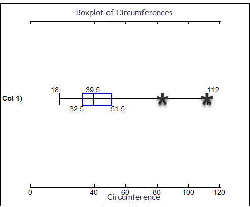
- The circumference measurements (in cm) of a sample of randomly selected trees on a farmer’s property is given below. Use the data to answer the following questions.
18 18 19 24 31 34 37 37 38 39 40 41 49 51 51 52 53 55 83 112 - CALCULATE THE FOLLOWING
Mean:
44.1 Median:
39.5 Mode:
18, 37, 51 MidRange:
65 Range:
94 Variance:
492.8 Standard Deviation:
22.2 Q1:
32.5 Q3:
51.5 IQR:
51.5 - 32.5 = 19 Are there any outliers in the data?
Yes, 83 and 112 are outliers
Lower Outlier Limit: Q1 – 1.5*IQR 32 – 1.5*19 = 4
Any data point less than 4 is an outlier.
Upper Outlier Limit: Q3 + 1.5*IQR 51.5 + 1.5*19 = 80
Any data point greater than 80 is an outlier.
- CREATE A BOXPLOT OF THE DATA: Mark outliers clearly on the boxplot.
- CALCULATE THE FOLLOWING
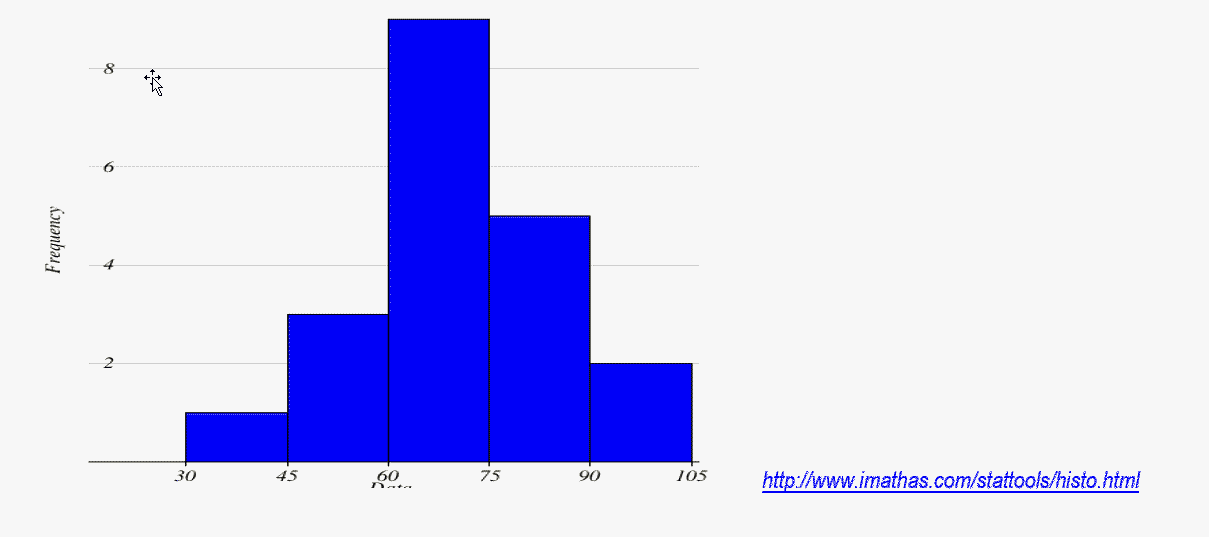
- Review of Frequency Distributions
- Use the data to construct a Frequency Distribution Table: Begin with a lower class limit of 30 and a class width of 15.
32 49 53 57 61 64 66 68 68 68 71 72 72 75 79 80 83 85 90 93
CLASS FREQUENCY RELATIVE FREQUENCY 30- 44 1
0.05
45-59
3
0.15
60-74
9
0.45
75-89
5
0.25
90-104
2
0.10
Cumulative Class Cumulative Frequency Less than 45
1
Less than 60
4
Less than 75
13
Less than 90
18
Less than 105
20
- Find the following using the Frequency Table (not the Relative or Cumulative summary information):
- •Lower Class Limit of the 3rd Class
60 - Lower Class Boundary of the 3rd Class
59.5
- •Lower Class Limit of the 3rd Class
- Midpoint of the 3rd Class
67
- Use the data to construct a Frequency Distribution Table: Begin with a lower class limit of 30 and a class width of 15.
- Use the Frequency Distribution (not Relative or Cumulative) to draw a Histogram of the data:
FIVE-NUMBER SUMMARIES AND PERCENTILES