Unit 1 Describing Data
2.5 Measures of Position
Percentiles
Percentiles divide a data set into 100 equal parts. In general you can say that P% of the data falls BELOW the Pth percentile.
To find the percentile that corresponds to a specific data entry, x:
The percentile of \(x=\frac{\text { number of data entries less than } \mathrm{x}}{\text { total number of data entries }} \times 100,\) and then round to the nearest whole number.
- Use the data to calculate percentile of the given test scores:
32 49 53 57 61 64 65 65 67 68 71 72 73 75 79 80 83 85 90 93
- Percentile of 53 =
\(\frac{2}{20} \times 100=10th\) percentile - Percentile of 64 =
\(\frac{5}{20} \times 100=25th \) percentile - Percentile of 71 =
\(\frac{10}{20} \times 100=50th\) percentile - Percentile of 75 =
\(\frac{13}{20} \times 100=65th \) percentile - Percentile of 90 =
\(\frac{18}{20} \times 100=90th \) percentile - Percentile of 80 =
\(\frac{15}{20} \times 100=75th \) percentile - Percentile of 64 =
- Percentile of 53 =
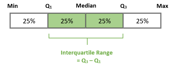
- \(IQR=Q_3-Q_1\)
- Lower Outlier Critical Value: \(Q_1 - 1.5(IQR)\)
- Upper Outlier Critical Value: \(Q_3 + 1.5(IQR)\)
- Use the data to find the 5-Number summary and identify outliers then construct a box plot.
32 49 53 57 61 64 66 68 68 68 71 72 72 75 79 80 83 85 90 93 - 5 number summary:
- Min:
32 - Q1:
62.5 - Median:
69.5 - Q3:
79.5 - Max:
93
- Min:
- Outlier Calculations: Identify any outliers in our data:
- \(IQR=\)
\(Q_{3}-Q_{1}=79.5-62.5=17\) - Lower Outlier Critical Value:
\(Q_{1}-1.5(IQR)=62.5-1.5(17)=37\) - Upper Outlier Critical Value:
\(Q_{3}+1.5( IQR)=79.5+1.5(17)=105\) - Outliers in our data:
32 is the only outlier. It is below the lower critical value of 37.
- \(IQR=\)
- 5 number summary:
- Use the data to find the 5-Number summary and identify outliers then construct a box plot.
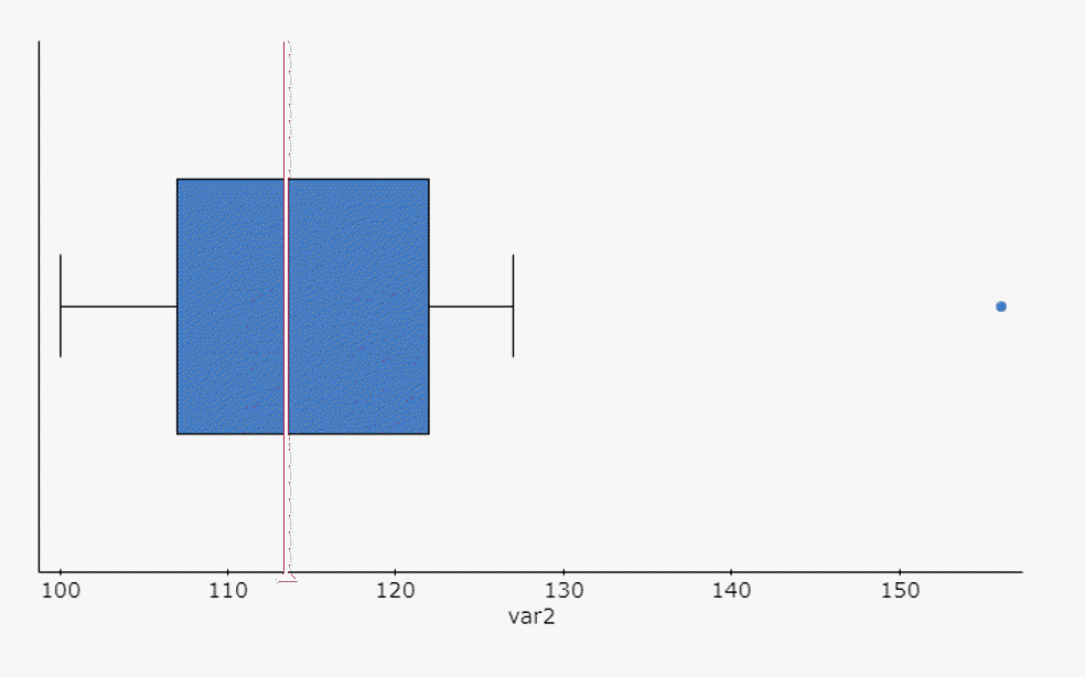
103 100 124 110 156 109 112 105 127 115 117 120 - 5-NUMBER SUMMARY : Use technology to find the five values.
- Min:
100 - Q1:
107 - Median:
113.5 - Q3:
122 - Max:
156
- Min:
- Outlier Calculations:
- \(IQR=\)
\(Q_{3}-Q_{1}=122-107=15\) - Lower Outlier Critical Value:
\(Q_{1}-1.5(IQR)=107-1.5(15)=84.5\) - Upper Outlier Critical Value:
\(Q_{3}+1.5(IQR)=122+1.5(15)=144.5\) - Outliers in our data:
156 is the only outlier. It is above the upper critical value of 144.5.
- \(IQR=\)
- Draw the Box Plot:
- 5-NUMBER SUMMARY : Use technology to find the five values.
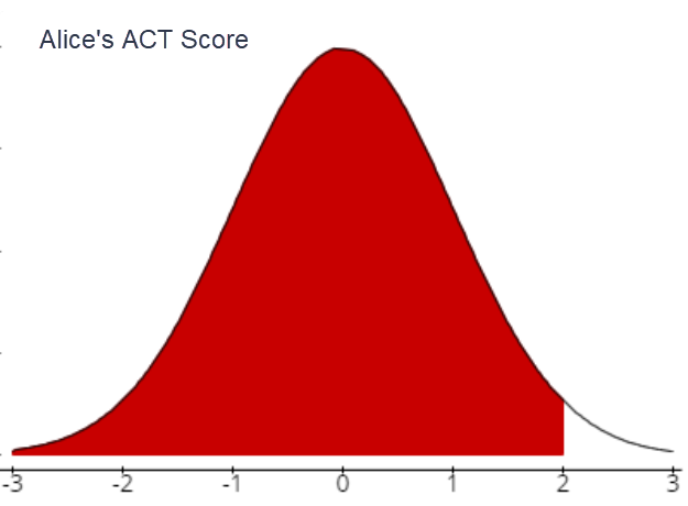
- Compare the following z-scores and interpret the results. The mean ACT score in the US is 24 with a standard deviation of 4. The mean SAT score in the US is 1100 with a standard deviation of 80. If Alice scores 32 on the ACT and Bob scores 1200 on the SAT, which has a better score, relative to the sample data?
- Alice's score on the ACT
- Alice's z-score:
\(\mu=24 ; \quad \sigma=4 ;\quad x=32 ;\quad Z=\frac{x-\mu}{\sigma}\)
\(Z_{32}=\frac{32-24}{4}=2.00\)
- What does this z score mean (in words)?
Alice’s ACT score of 32 is 2 standard.deviations above the population mean of 24.
- Sketch a bell curve and mark the score on the curve
- Alice's z-score:
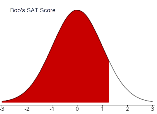
- Bob's score on the SAT
- Bob's z-score: \(\mu=1100 ; \quad \sigma=80 ; \quad x=1200\)
\(Z_{1200}=\frac{1200-1100}{80}=1.25\)
- What does this z score mean (in words)?
Bob’s SAT score of 1200 is 1.25 standard deviations above the population mean of 1100.
- Sketch a bell curve and mark the score on the curve
- Bob's z-score: \(\mu=1100 ; \quad \sigma=80 ; \quad x=1200\)
- Relative to other students in the population, which score is better?
Alice’s relative score is better. She is 2 standard deviations above the mean. Bob’s score is only 1.25 standard deviations above the mean.
- Alice's score on the ACT
- Compare the following z scores and interpret the results.
Two common indicators of the health of a population are life expectancy and infant mortality (the number of deaths before age 5 per 1000 children born).
In 2018, globally the mean life expectancy was 72.66 years, with a standard deviation of 7.25 years. For the same year, the world-wide mean infant mortality rate was 29.47 per 1000 children born with a standard deviation of 29.22 per 1000.
The life expectancy in South Korea is 81.3 years, and the infant mortality rate in the U.S. is 6.06 per 1000. Which of these indicators represents a better health outcome?
\(z_{81.3}=\frac{81.3-72.66}{7.25}=1.192\)
\(z_{6.06}=\frac{6.06-29.47}{29.22}=-0.801\)
The life expectancy in South Korea is 1.192 standard deviations above the mean, and the infant mortality rate in the U.S. is 0.801 standard deviations below the mean. South Korea’s life expectancy indicates a better health outcome because it is further from the mean. Note that a negative z-score for infant mortality is positive, it is just not as much better than average as the life expectancy.
Five Number Summary and the Box Plot
Quartiles
measures of location, denoted Q1, Q2 (Median), and Q3, which divide a set of data into four groups with about 25% of the values in each group.5-Number Summary:
Minimum, Q1, Median, Q3, Maximum
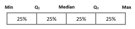
Inter-Quartile Range (IQR):
The range of the “middle” 50% of the data is called the interquartile range.
Outliers:
are observed values that lie an abnormal distance from other values in a random sample from a population. In our course, outliers will be defined as data values outside the boundaries of the max and min outlier critical values.Outlier Calculations:
Calculating and Comparing Z Scores:
Calculating z-scores
z-score: the number of standard deviations a given value of x is above or below the mean.Sample: \(z=\frac{x-\overline{x}}{s}\)
Population: \(Z=\frac{x-\mu}{\sigma}\)
Comparing z-scores
The Range Rule of Thumb for Unusual Values
According to the range rule of thumb, most values should lie within 2 standard deviations of the mean.
We can therefore identify “unusual” values by determining if they lie outside these limits:
Maximum usual value = \(\mu+2 \sigma\)
Minimum usual value = \(\mu-2 \sigma\)
When defining unusual events, why do we use 2 standard deviations as our distance from the mean?According to the Empirical Rule, we identified the area between \(z=-2\) and \(z=2\) as 0.95 or 95% probability.
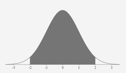
This leaves a total probability of 0.05 or 5% in the two areas outside the region between z=-2 and z=2.
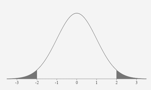
In this section, we have defined an unusual event as one having a less than 5% probability of occurring. Therefore, based on the Empirical Rule, events that fall more than 2 standard deviations away from the mean are considered unusual.