Unit 1 Describing Data
2.2 More Graphs and Displays
Dot Plots
- An instructor assigns MATH 1530 students in the class to poll 11 randomly selected people on campus with the following question: “On average, how many hours per day do you spend playing video games?” Analyze the responses.
-
27.2 26.9 26.6 28.0 26.8 26.1 26.2 27.3 27.6 25.7 29.0 26.5 32.8 28.8 26.9 25.0 26.7 24.6 26.3 26.8 27.0 28.0 27.3 26.5 27.4 25.0 26.6 25.8 27.0 25.9 Stem Leaves 24 6 25 0 0 7 8 9 26 1 2 3 5 5 6 6 7 8 8 9 9 27 0 0 2 3 3 4 6 28 0 0 8 29 0 30 31 32 8 Key: 26|1=26.1 - How is a stem and leaf plot similar to a histogram?
Both types of graphs show the distribution of a set of data; each stem is like a bin in a histogram
- Construct a stem and leaf chart for the fuel economy information (city mpg) on Toyota's 2012 vehicle line. Arrange the stems from the highest at the top to the lowest at the bottom.
26 20 43 30 19 17 51 21 28 13 44 21 25 19 14 16 22 17 27 Stem Leaves 5 1 4 3 4 3 0 2 0 1 1 2 5 6 7 8 1 3 4 6 7 7 9 9 Key: 1|9=19 - Construct another stem and leaf chart using the same fuel economy data, but this time expand the stems so the low digit leaves of 0, 1, 2, 3, 4 are on a different stem than the high digit leaves.
Stem Leaves 5 5 1 4 4 3 4 3 3 0 2 5 6 7 8 2 0 1 1 2 1 6 7 7 9 9 1 3 4 Key: 1|9=19 - Construct a back-to-back stemplot to see how mileage numbers have changed over the decades. Compare Toyota's 2012 fuel economy information with that of 1984.
32 30 26 26 25 25 24 24 23 21 21 20 20
1984 Leaves Stem 2012 Leaves 5 5 1 4 4 3 4 3 2 0 3 0 6 6 5 5 2 5 6 7 8 4 4 3 1 1 0 0 2 0 1 1 2 1 6 7 7 9 9 1 3 4 Key: 5|1=51 Misleading Graphs
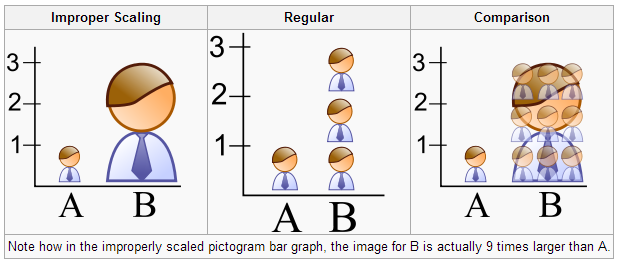
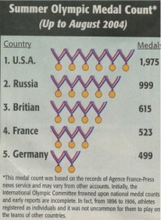
- Pictograph:
- Using 3-dimensional representations distort sizes.
- Graph may be drawn to the correct height, but the brain perceives area.
- Bar graphs/Line graphs:
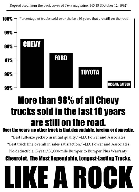
- Check for y-axis starting at 0. Otherwise differences are exaggerated.
- Check that y-axis has a consistent and appropriate scale.
- Check that there is not a “break” in the y-axis.
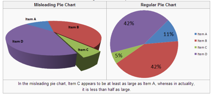
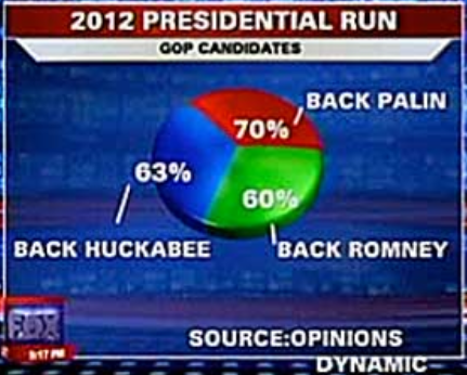
- Pie Chart:
- 3-dimensional representations distort areas.
- Used only when there are parts of a whole. (Must add to 100%)
- Other:
- Going against conventions
- Cherry picking data
- Using the wrong graph
- How is a stem and leaf plot similar to a histogram?
Stem-and-Leaf Plots
Below are the foot lengths (in centimeters) for thirty soldiers. Construct a stem and leaf chart for the data.