Statistics Unit
2.5 Graphics in the Media
GRAPH #1:
DEATH RATES AGES 45 to 54
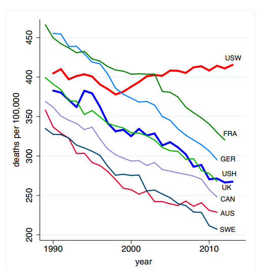
Fig. 1. All-cause mortality, ages 45 to 54 for US White non-Hispanics (USW), US Hispanics (USH), and six comparison countries: France (FRA), Germany (GER), the United Kingdom (UK), Canada (CAN), Australia (AUS), and Sweden (SWE).
Source: Website Source for Graphic
GRAPH #2:
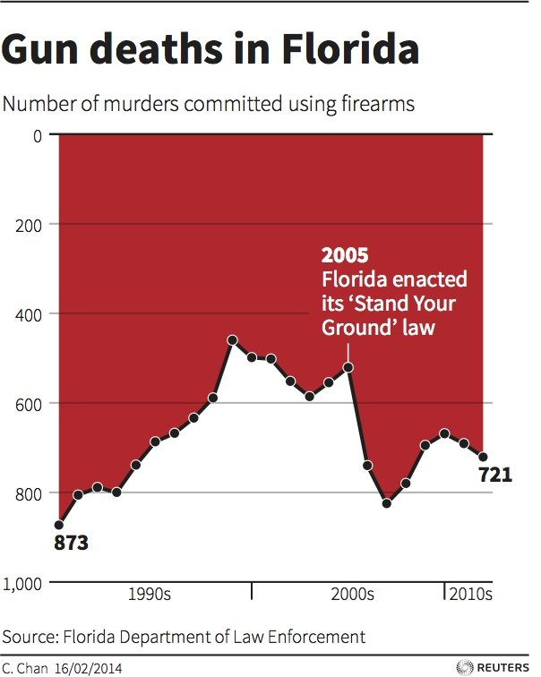
Source: Website Source for Graphic
GRAPH #3:
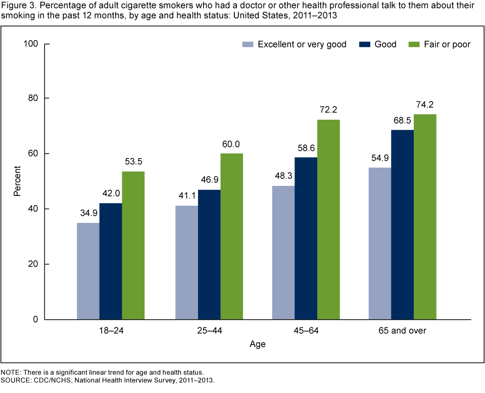
Source: Website Source for Graphic
GRAPH #4:
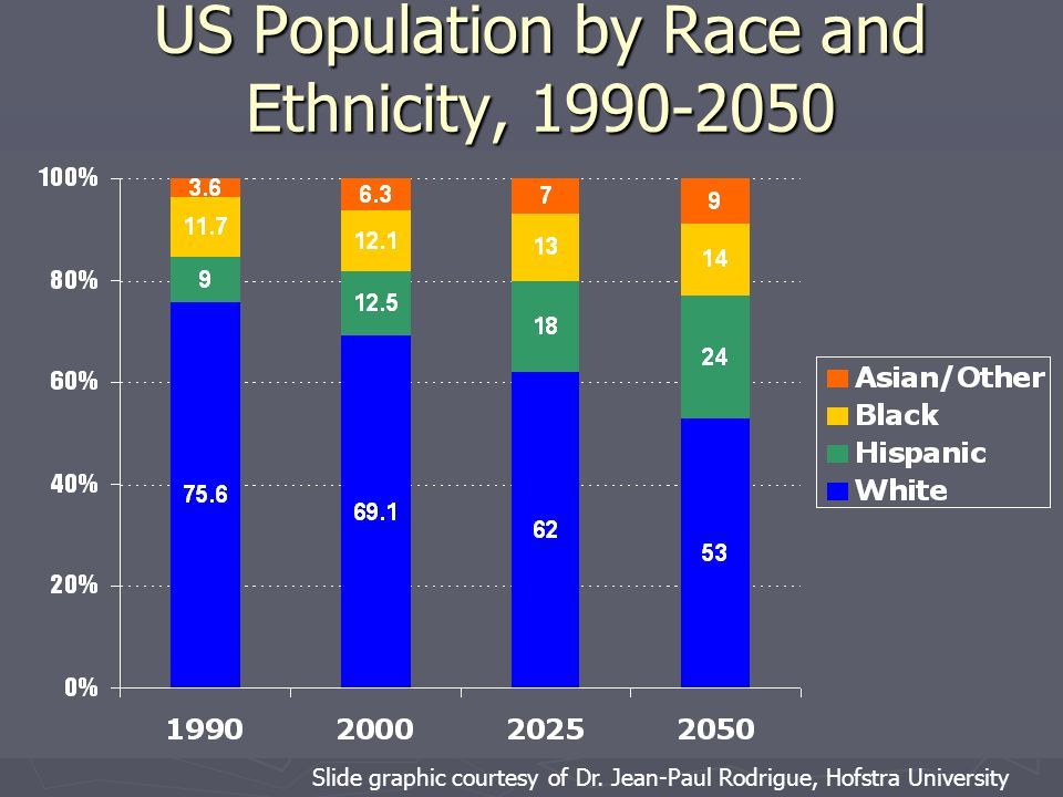
Source Website Source for Graphic
GRAPH #5:

Source Website Source for Graphic