Statistics Unit
2.2 Interpreting Graphs on a Coordinate System
- Interpret point A in terms of point B.
- Now interpret point B in terms of point A.
- Do the same for the following graph:
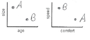
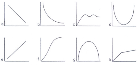
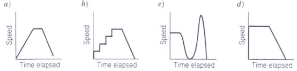
- The following three graphs provide information about two cars:
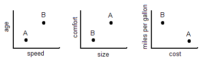
Determine if each following statements is true or false.
- The older car is the slower car.
False - The larger car has a more comfortable ride.
True - The car with the better gas mileage costs more.
False - The faster car gets better gas mileage.
True
- The older car is the slower car.
- Match points on the coordinate system grid that represents heights and ages of the individuals with sketches of the individuals.
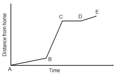
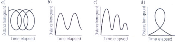
- This graph represents a portion of the morning commute to school by one student. Explain what is happening for each section of the graph.
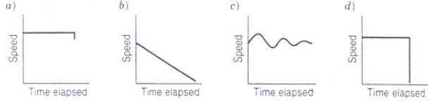
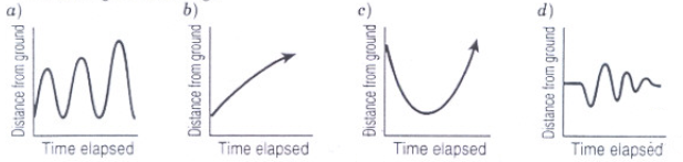
- Match the following scenarios with the graphs below. Label the axes.
- A train pulls into a station and lets off its passengers.
- A man takes a ride on a Ferris wheel.
- A woman climbs a hill at a steady pace and then starts to run down one side.
- A child swings on a swing.
- A child climbs up a slide and then slides down.
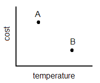
A is higher in cost and lower in temperature than B.
B is lower in cost and higher in temperature than A.
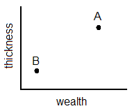
A is thicker and wealthier than B. B is thinner and not as wealthy as A.
Place points A and B representing the two cars on the graphs below:
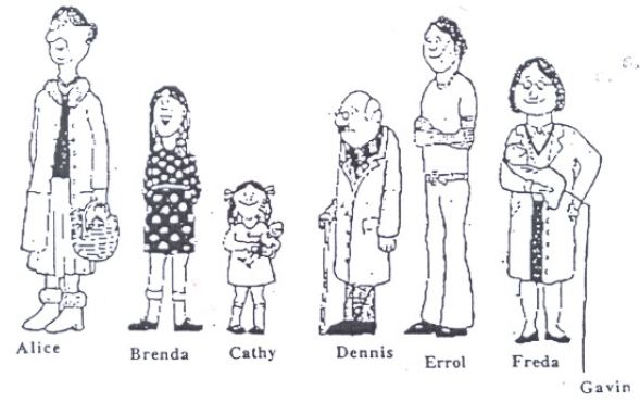
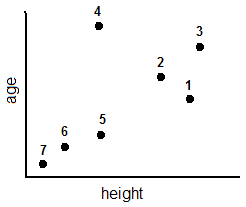
1. Errol 2. Freda 3. Alice 4. Dennis 5. Brenda 6. Cathy 7. Gavin
A. The population of frogs decreased as the pond became more polluted.
Graph b
The horizontal axis represents the amount of pollution in the pond and the vertical axis represents the population of frogs in the pond.
B. The diameter of the cocoon increased rapidly at first, then increased more slowly as the caterpillar prepared to change into a butterfly.
Graph f
The horizontal axis represents time and the vertical axis represents the diameter of the cocoon.
C. The temperature of the oven changed after the oven was turned on.
Graph c
The horizontal axis represents time and the vertical axis represents the temperature of the oven.
D. The length of time it takes to paint the gymnasium changed as the number of people painting increased.
Graph a
The horizontal axis represents the number of people painting the gym and the vertical axis represents the amount of time it takes to paint the gym.
Choose the graph the matches each statement:
Graph b
Graph b
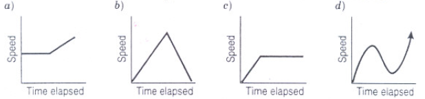
Graph a
Graph a
Graph c